|
|
Post by annarhodes on Nov 23, 2010 12:01:49 GMT -5
I expected something different, with more impact. This cover not makes me jump on my chair.
|
|
marcmassive
LIBERTY
 The Butterfly escapes the killing jar
Posts: 155
|
Post by marcmassive on Nov 23, 2010 12:23:55 GMT -5
eagle eyed with the chandelier didn't spot that..suppose it ties in with the chandeliers above the bed. The tiled Lino flooring reminds me of something you'd find in a old Russian widow woman's bedroom as is the lace quilted bed. Maybe the burn is significant of the night the chandelier fell onto the bed, causing a burning bed which killed the old Russian woman's husband hence why she's a widow!! erm or am I looking into it all too deeply trying to find a narrative. I do find myself scanning it though to see if i can work out any beedy eyes or mysterious figure hidden within...hours of fun.
|
|
blaahh
PAPER GOD
 Still breathing
Posts: 2,583
|
Post by blaahh on Nov 23, 2010 12:45:39 GMT -5
looks like a single cover - hate the duran duran text. not bad otherwise..
|
|
2007
NOTORIOUS

Posts: 851
|
Post by 2007 on Nov 23, 2010 12:48:06 GMT -5
It's a little better than the Xmas EP cover maybe it's to do with that familiar pink! But still, it's such common design which tries hard to be the trashy cool.. Hoping to like it more when I own a copy of the CD.
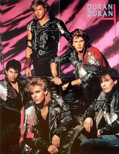
By the way, the handwriting looks like John's!
0:-)
|
|
rhondar
BIG THING
good times, good times!
Posts: 628
|
Post by rhondar on Nov 23, 2010 16:34:41 GMT -5
I'm pretty sure the handwriting is Cluney Reids - she writes on pretty much all of her work (that I have seen), and that's her handwriting - it's part of her style, and a good reason for why her work is so recognizable. I still can't see a damn thing other than the bed, which is driving me crazy because I'd like to be able to weigh in on what I think it means. Right now all I'm getting is that it's intentional that we can't see all of it clearly. Only certain bits and pieces of the work are in focus, as if we don't need to see the before, we don't need to see the after, all we need to see is the now. Hmm...gee I wonder where THAT idea came from?  I still want to see what's actually IN the photos though, darn it. I totally agree with RandalGraves though - the band didn't need to be on the cover. That's so boring and overdone. This will at least stand out and it's worth talking about!! I like that the meaning of the artwork isn't obvious - we might actually have to use our brain cells to make sense of it! *gasp* |
|
|
|
Post by juzzab on Nov 23, 2010 17:57:09 GMT -5
Bunch of mugs if they paid for that crock of sh*te! If they're that embarrassed by it being a Duran album then just release it in a brown paper bag. At least with it being a digital release people the cover won't be that important.
|
|
|
|
Post by andre005 on Nov 23, 2010 18:56:38 GMT -5
Me too I hate the font-it's okay nothing special in my opinion..would have loved to have seen what else the artist came up with--I just wanted an album with a group photo or something ala Rio if this was supposed to be a rio 2...man i miss the early album covers..artsy smartsy..lol
Maybe one day DD will ask the fans to vote or heck maybe ask for a fan to submit the artwork for the cover! That would be something special--I do hate the new album art--sometimes I don't get DD....I wanted something bright clean and classy just like the older albums...oh well I guess it's all about the music but still......can we reconsider guys?
|
|
|
|
Post by sueb1863 on Nov 23, 2010 19:01:22 GMT -5
Most people aren't going to have the patience to puzzle the cover out. I think they'll just look at it, go "Ew," and move on.
|
|
|
|
Post by andre005 on Nov 23, 2010 19:03:40 GMT -5
Is this the cover for the single or the entire album coming out in February? Man why does DD not think outside the box anymore--the more I see this artwork the more I hate it!!! that dang font! So sloppy and ugly looking....I think I would have done something more retro and updated--lol
|
|
|
|
Post by andre005 on Nov 23, 2010 19:46:19 GMT -5
Yeah but the artist had like 15 covers--let us fans choose or choose something that appeals to the masses not this garbage!! All you need is not this cover!!!! It looks dull and it is boring and a band like DD could have had a fan come up with something a million times better then someone who thinks he or she is an artist! Why not have a fan choose the cover for once and do something outside the frickin box!! lol
|
|


 I still want to see what's actually IN the photos though, darn it.